In the vibrant tapestry of modern design, where every pixel speaks and every image breathes life into ideas, the power of visuals cannot be underestimated. Yet, amidst this symphony of creativity, integrating stock images seamlessly into your designs can sometimes feel like threading a needle in a whirlwind. Fear not, dear designer, for you are not alone on this journey. Welcome to your guiding star, your creative compass — a treasure trove of best practices for transforming ordinary stock images into the extraordinary elements of your artistic vision. Here, we embrace the art of blending, the science of alignment, and the magic of storytelling, ensuring that your designs not only shine but sing with harmony and purpose. Let’s embark on this adventure together, where every image you choose has the power to elevate, inspire, and connect.
Choosing the right stock images can significantly elevate your design project, offering a polished look that captivates your audience. Here are some key considerations to ensure you’re selecting only the best images.
**Quality Over Quantity:** Always prioritize high-resolution images. Blurry or pixelated photos can detract from the professionalism of your design. Look for images with clear focus, balanced lighting, and sharp details. High-quality images allow for better manipulation and scaling without losing clarity.
**Relevance to Your Brand:** Ensure the images align with your brand’s voice and style. Whether your brand exudes elegance, adventure, or minimalism, your imagery should reinforce these qualities. **Consistency in visual tone** builds a coherent and appealing narrative for your audience.
**Avoid Clichés:** Stock images often fall prey to overly staged scenarios and clichés. Strive for authenticity by choosing photos that feel genuine and relatable. Look for diverse models and natural settings to foster a more modern and inclusive feel.
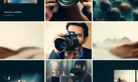
Low-Quality Indicators
High-Quality Indicators
Blurry Edges
Sharp Focus
Washed-Out Colors
Rich, Accurate Colors
Overly Staged Poses
Natural, Candid Shots
**Diversity and Inclusivity:** Seek out images that represent a wide range of people, cultures, and lifestyles. By showcasing diversity, not only do you communicate inclusivity, but you also connect with a broader audience. **Diverse representation** can make your project more relatable and human-centered.
**Licensing and Usage:** Remember to check the licensing agreement for each image. Using images outside their licensed terms can lead to legal issues. Platforms like Unsplash, Pexels, and Shutterstock offer various licenses; make sure you understand the rights and limitations for each image.
By following these best practices, you’ll find stock images that not only enhance your design but also resonate with your intended audience, combining visual appeal with meaningful content.
Aligning Images with Brand Identity
To ensure that your selected stock images resonate with your brand’s essence, it is essential to consider a few vital elements and best practices. Envision your brand’s core values, target audience, and overall aesthetic before diving into image selection. This strategic approach transforms generic stock images into powerful visual tools that speak your brand’s language.
**Color Palette:** Opt for images that reflect your brand’s color scheme. Consistent use of colors establishes visual coherence and promotes brand recognition. Whether it’s the calming blues of a wellness brand or the vibrant yellows of a creative agency, aligning colors strengthens brand identity.
**Typography Harmony:** Ensure any text within the image complements your brand’s fonts.
**Mood and Tone:** Reflect the brand’s personality—be it playful, elegant, or adventurous.
**Cultural Relevance:** Choose images that relate to the demographics and values of your audience.
**Image Quality:** High-resolution images convey professionalism and credibility. Avoid pixelated or low-quality images that detract from your message. Opt for images that are sharp, clear, and well-lit. Here’s a comparative table to highlight the impact of quality:
Aspect
Low-Quality Image
High-Quality Image
Resolution
Blurred, Pixelated
Crisp, Clear
Lighting
Dark, Shadowed
Bright, Properly Lit
Brand Perception
Amateur, Untrustworthy
Professional, Trustworthy
**Contextual Relevance:** Ensure the imagery you select is contextually aligned with the content it accompanies. An image of a relaxed vacationing family may look visually appealing, but it might not fit a blog post about financial turmoil. The correctness of the image in relation to the accompanying text ensures a seamless and immersive user experience.
Take into account any additional elements such as brand overlays, logo placements, or specific filters and edits that could tweak the stock images to fit seamlessly with your brand. By being diligent and deliberate in your selection, your visuals will become a true extension of your brand’s voice, aura, and narrative.
Ensuring Legal and Ethical Use
When incorporating stock images into your designs, adhering to legal and ethical standards is crucial. This not only protects you from potential legal repercussions but also respects the rights and creativity of photographers and illustrators. Ensuring you have a proper understanding and application of licenses is the first step in ethical usage.
Understand Licenses:
**Royalty-Free**: Allows repeated use but not exclusivity. Perfect for blog posts and marketing materials.
**Rights-Managed**: Used for a specific purpose, duration, and geographic location. Ideal for specialized campaigns.
**Creative Commons (CC)**: Varies by type, permitting different levels of use. Always check individual licenses for specific restrictions.
Avoid Modifying Images Unethically:
**No Derivative Works**: Some licenses prohibit any modifications. Always check if changes are allowed.
**Respect the Integrity**: Avoid altering images in a way that misrepresents the subject or context.
Attribution is Key:
**Proper Credits**: Always credit the creator if the license requires it. This is especially important for Creative Commons images.
**Use Embed Code**: When available, use the provided embed codes for proper attribution and compliance.
License Type
Usage Rights
Attribution Required
Royalty-Free
Multiple uses, non-exclusive
No
Rights-Managed
Specific use, limited duration
Varies
Creative Commons
Varies by type
Yes
Customizing Stock Photos for Personal Touch
One of the most powerful ways to make stock photos truly yours is by adding **unique elements**. By incorporating your brand’s color palette, adding overlays, or inserting custom graphics, you can transform generic images into personalized visuals that resonate with your audience. Use tools like Photoshop, Canva, or even online photo editors to tweak stock images until they blend seamlessly with your branding.
**Color Adjustments:** Change the hue and saturation to match your brand colors.
**Overlays:** Add semi-transparent layers for text overlay or to mute busy backgrounds.
**Custom Graphics:** Insert icons, logos, or other custom graphics that reflect your brand’s identity.
Tool
Feature
Benefit
Photoshop
Advanced Editing
Highly customizable
Canva
User-Friendly
Quick and easy
Online Editors
Accessibility
No installation required
Another way to add a personal touch is by focusing on the **context** in which the stock photo is used. Instead of just placing an image as it is, consider combining it with relatable scenes or familiar settings that mirror the environment your audience operates in. By doing so, you make the image appear as if it was taken specifically for your project’s environment.
**Real-life Application:** Pair the stock photo with images of your products or services in use.
**Audience Specific:** Choose images that reflect the demographic and lifestyle of your target audience.
Lastly, **text placement** and **typography** play crucial roles in drafting a coherent and strong visual message. With the right font and placement, text can dramatically alter the perception of an image, turning it into a compelling narrative tool. Whether it’s a bold headline or a subtle caption, make sure the text complements the image rather than overpowering it.
Balancing Text and Imagery
In the world of design, striking the right balance between text and imagery can make or break your project. Stock images are a fantastic resource, but incorporating them effectively requires a keen eye for harmony. Here’s how to achieve a seamless blend:
Prioritize Readability
When integrating images, make sure they complement the text without overpowering it. Text should be clear and easy to read, whether overlaid on an image or positioned beside it. Use contrast to enhance readability. Dark text works well over light images, while light text stands out against darker backgrounds.
Contrast: Ensure there’s a stark contrast between text and imagery.
Spacing: Maintain adequate padding to prevent text from feeling cramped.
Font Choice: Opt for bold fonts that command attention.
Utilize Image Placement Wisely
Strategic placement of images can guide the reader’s eye and reinforce the storytelling element of your design. Align images with the corresponding text to maintain a logical flow and avoid disorienting the viewer.
If space allows, consider breaking up long blocks of text with images, creating a more engaging and digestible layout. For a more structured appearance, use WordPress table styling:
Text Placement
Image Placement
Left-aligned
Right-aligned
Top-half
Bottom-half
Centered
Background
Consistent Style
Consistency is key when using stock images. Stick to a cohesive theme that matches the overall tone of your design. This could mean using images with similar color palettes, styles, or subjects. Having a harmonious visual theme will reinforce your branding and create a polished look.
Pair stock images with customized elements like filters or overlays to make them feel unique to your project. This way, even common stock images can become distinct parts of your visual story.
By mindfully , you can craft visually compelling designs that are both informative and aesthetically pleasing.
Optimizing Images for Web and Print
To ensure your chosen stock images make the biggest impact, optimizing them correctly is key. Whether they’re used on a website or in printed materials, different techniques are required to maintain high quality without unnecessary bloat. With the right approach, your images will not only look stunning but will also load quickly and print crisply.
Web Optimization Tips
Choose the Right Format: For web use, JPEG is optimal for photographs due to its balance of quality and file size, while PNG works best for images requiring transparency.
Lazy Loading: Implementing lazy loading ensures that images load only when they come into the user’s view, speeding up initial load times.
Responsive Images: Use the element or srcset attribute to deliver different image sizes based on the device screen size, creating a seamless user experience.
Print Optimization Techniques
High-Resolution Requirements: Print images should be at least 300 DPI to ensure they appear crisp and sharp. Investigate the highest resolution options available in your stock image service.
Color Profile: Convert images to CMYK color mode before sending them for print to ensure color accuracy.
Bleed Area: Add a 1/8 inch bleed around the image to prevent unintended white borders when the image is trimmed.
Type
Format
Optimal DPI
Web
JPEG/PNG
72 DPI
Print
TIF/CMYK JPEG
300 DPI
By following these practices, you ensure your stock images not only captivate but also perform efficiently. These tips equip your designs with the quality needed to thrive both online and in print mediums.
Incorporating Diversity in Visual Content
One of the first steps to fostering inclusivity is ensuring that your visual content reflects a broad spectrum of demographics. This means selecting stock images that feature people of different ethnicities, ages, genders, body types, and abilities. When you include ***an array of faces and stories***, you’re not just filling a quota; you’re communicating to your audience that everyone is seen and valued.
Consider the context in which your images will be displayed. Does your design call for a family enjoying a day at the park? Why not showcase families from various cultural backgrounds doing the same activity? Below is a quick guide for balancing diversity in visual content:
Mix of Ethnicities: Ensure a balanced representation of various ethnic groups.
Gender Representation: Avoid stereotypes by presenting people in varied roles irrespective of gender.
Body Positivity: Include images that highlight different body types and sizes.
Ability Awareness: Use images that represent individuals with disabilities in empowering scenarios.
To make your approach more structured, here’s a handy reference table:
Category
Representation Tips
Ethnicity
Include diverse cultural backgrounds
Age
Show young, middle-aged, and elderly individuals
Gender
Avoid traditional gender roles in imagery
Body Type
Highlight diversity in body shapes and sizes
Ability
Feature differently-abled individuals
When these elements come together, they paint a vibrant, inclusive picture that is not just eye-catching but also resonates with a wider audience. Always aim for an authentic representation that goes beyond tokenism. Choose images that are real, relatable, and respectful.
Maintaining Consistent Style and Color Palette
One of the most critical aspects of seamlessly integrating stock images into your design is maintaining a consistent style and color palette. This continuity is essential for creating a cohesive visual experience. **Divergent styles and colors can make a project look disjointed and unprofessional**. Therefore, it’s vital to establish a set of visual guidelines from the outset.
Consider these points:
**Choose a cohesive set of stock images**: Look for images from the same photo shoot or from the same photographer to ensure a unified look.
**Edit for consistency**: Use editing tools to adjust color balance, brightness, and contrast so that all images feel part of the same visual narrative.
Here’s a sample comparison of key elements to monitor for coherence:
Element
Action
Color Palette
Maintain uniform hues or tonal ranges across all images.
Style
Match image styles (e.g., vintage, minimalistic) to your design ethos.
Composition
Ensure compositional elements like framing and focus are consistent.
Using tools like **Adobe Lightroom or Photoshop** can help in achieving consistency across your images. Batch processing in these applications can save time while ensuring that your images all adhere to your predefined style. Additionally, you can create and apply presets that match your color palette and stylistic choices.
Lastly, don’t underestimate the power of **feedback and iteration**. Share your designs with team members or peers to get fresh perspectives on how well the images blend with the overall design. **Effective integration requires attention to detail and a willingness to refine** until the desired consistency is achieved, resulting in a polished and cohesive final product.
Utilizing Visual Hierarchy for Impact
Visual hierarchy is crucial in catching the viewer’s eye and guiding them through your design effortlessly. By strategically integrating stock images, you can heighten your design’s impact, ensuring that the message and visuals complement each other seamlessly.
Focal Points: Carefully choose stock images with clear focal points to direct attention where you want it. This could be a central figure in a photograph or a highlighted element in an illustrative graphic.
Layering: Using layers not only adds depth but also emphasizes important elements. For example, overlaying text on semi-transparent images ensures that both the copy and imagery are visible and prioritized correctly.
Contrast: High-contrast images stand out more and can delineate different sections of your design. Experiment with light and dark areas to create a dynamic composition that draws the viewer’s eye.
Implementing Visual Hierarchy
When utilizing stock images, consider the following strategies to ensure a coherent visual relationship between images and text.
Element
Strategy
Header
Pair with striking, high-definition stock photos to capture immediate interest.
Body Text
Use images that complement the narrative without overshadowing the content.
Call-to-Action
Incorporate bold images with clear focal points to drive action.
Combining stock images with thoughtful visual hierarchy practices ensures your design is both aesthetically pleasing and functional. Keep in mind the core values your design seeks to convey, and select images that reinforce those messages through strategically placed visual elements.
The Conclusion
As you venture into the world of design, remember that integrating stock images can elevate your projects into works of art. By following the best practices outlined in this article, you can blend creativity with professionalism to create visually stunning designs that leave a lasting impression. Embrace the power of stock images in your design process and let your creativity soar to new heights. Happy designing!


